As part of my daughter’s school project to promote recycling and waste management, I recently developed a web application to help blind people locate nearby recycle bins. What made this project unique was my approach: I leveraged AI technology and modern development tools throughout the process, from initial coding to final deployment and presentation, while also focusing on accessibility.

Development Environment and Version Control
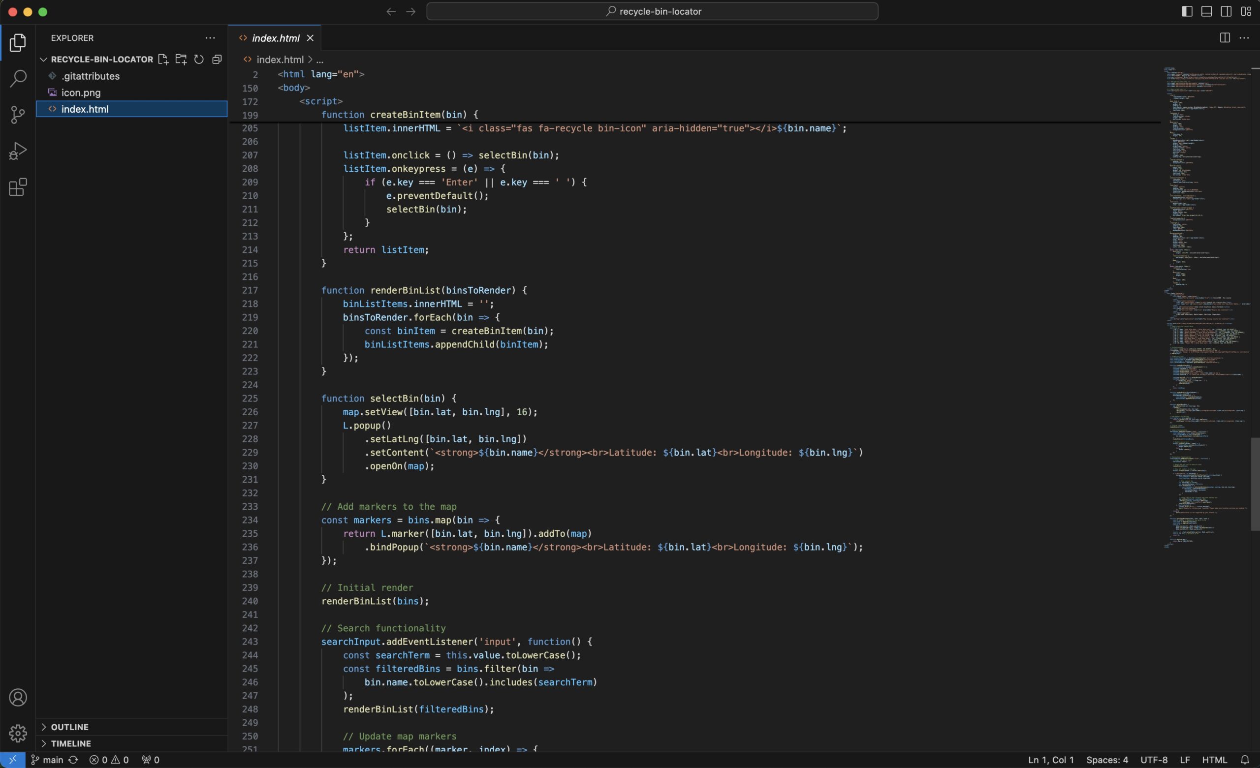
I chose Visual Studio Code as my primary development environment for its robust features and extensive plugin ecosystem. This powerful editor allowed me to efficiently write and manage my HTML, CSS, and JavaScript code.
For version control and collaborative possibilities, I used GitHub. This not only helped me track changes and manage my codebase but also set the stage for an easy deployment process later on.
Getting Started with AI Assistance
I started with a basic idea: create a web app that shows garbage bin locations on a map. I asked Claude, an AI assistant, to help me set up the initial HTML structure and incorporate the Leaflet.js library for mapping functionality. Claude provided a complete HTML document with embedded CSS and JavaScript, which served as an excellent starting point.
Adding Core Functionality
With the basic structure in place, I worked with Claude to add key features:
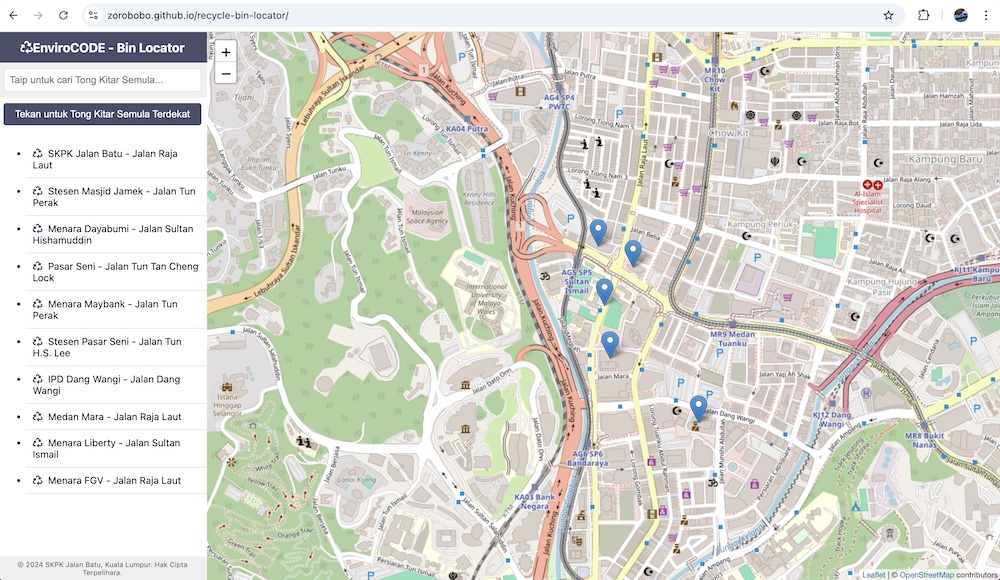
- Interactive Map: Claude helped implement a Leaflet map centered on my local area.
- Recycle Bin Locations: We added sample data for bin locations and displayed them as markers on the map.
- Searchable List: Claude guided me in creating a searchable list of bin locations that updates dynamically.
- Geolocation: We implemented functionality to find the user’s current location and the nearest bin.
Improving Mobile Responsiveness
As the app took shape, I realized it needed to be more mobile-friendly. Claude provided CSS updates to make the layout responsive, ensuring the app worked well on both desktop and mobile devices.

Enhancing the User Interface and Accessibility
To make the app more visually appealing, user-friendly, and accessible, I asked Claude for suggestions. We made several improvements:
- Adjusted font sizes for better readability
- Implemented a more compact layout for mobile devices
- Improved the header design to work better with iOS devices’ status bar
- Added appropriate ARIA labels and roles to make the app compatible with screen readers
- Ensured proper keyboard navigation for all interactive elements
Ensuring Screen Reader Compatibility
A significant part of the development process involved making sure the web app was accessible to users relying on screen readers. This included:
- Using semantic HTML to provide a clear structure for screen readers
- Adding descriptive alt text to all images and icons
- Ensuring that all interactive elements were properly labeled and could be accessed via keyboard
- Testing the app with VoiceOver on iOS to identify and fix any accessibility issues
We encountered some challenges with the list scrollability on iOS when using VoiceOver, which required additional tweaks to the CSS and HTML structure to resolve.
Adding Advanced Features
As the project evolved, I decided to add more advanced functionality:
- iOS Home Screen Compatibility: Claude helped modify the HTML and CSS to make the app suitable for adding to the iOS home screen, including proper status bar handling.
- Routing Functionality: In the final stage, we added routing capabilities using the Leaflet Routing Machine plugin. This allows users to get directions to their chosen bin location.
Deployment
Once the development was complete, I leveraged GitHub’s powerful deployment tools to make my app live. Using GitHub Pages, I was able to deploy my web app quickly and easily. The app is now accessible at https://zorobobo.github.io/recycle-bin-locator/, allowing anyone to locate nearby recycle bins with ease.
Preparing the Presentation
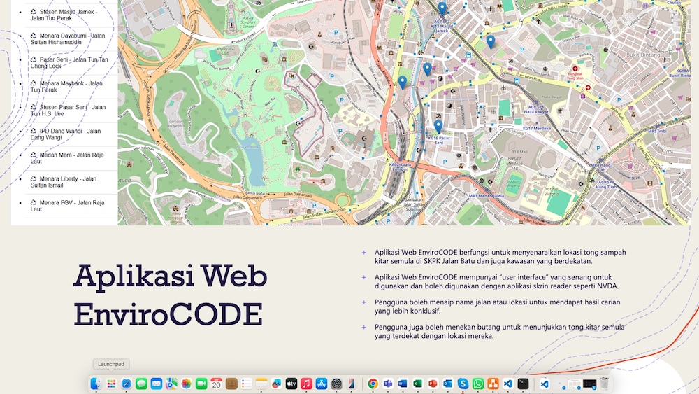
With the app developed and deployed, I turned my attention to creating a presentation to showcase my work. This is where Microsoft 365 Copilot and PowerPoint came in handy. I used Copilot to help me structure my presentation, generate compelling slide content, and even suggest visually appealing layouts. Copilot’s ability to understand the context of my project and suggest relevant content significantly streamlined my presentation preparation process.

Conclusion
Using a combination of AI assistants (Claude and Microsoft Copilot) and modern development tools (Visual Studio Code and GitHub) to develop, deploy, and present this Garbage Bin Locator web app was an incredibly efficient and educational experience. The focus on accessibility, particularly ensuring compatibility with screen readers, added an important dimension to the project, making the app truly inclusive.
One More Thing
Total time spent to build the site and come up with the presentation slides: About 6 hours. Note: I used Claude to generate this blog post based on the conversation thread we had working on the site. Pretty nifty eh?

