What a nice day for a run. Out of curiousity I bought the Nike+ GPS app for the iPhone for USD 1.99 and decided to put it through its paces. I ran laps around a lake until I was dizzy, and then ran nearly 2 kilometers on open road under the bright morning sun. Have done that (and fiddled with the app to a certain degree), I came to realise that hey, I’ve been using these features all these while in an app called….Adidas miCoach. Dum da dum….cue silence.
Anyways, these two apps are remarkably similar but since there can only be one (if you side certain brands, or are on a budget), lets do a comparison. Here are the features that, well, are pretty much similar between the two apps:
- Track runs/workouts (pace, distance, route using GPS, calories burned)
- Playlists
- Workout histories (showing maps and workout details)
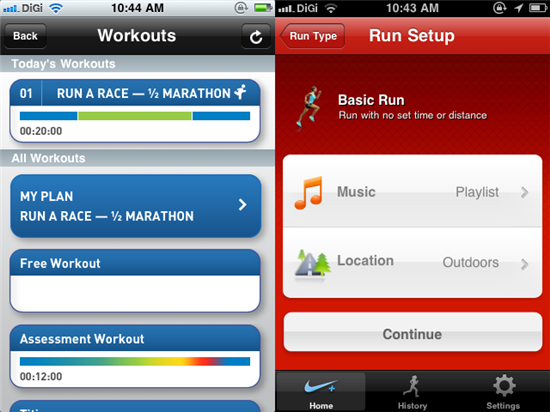
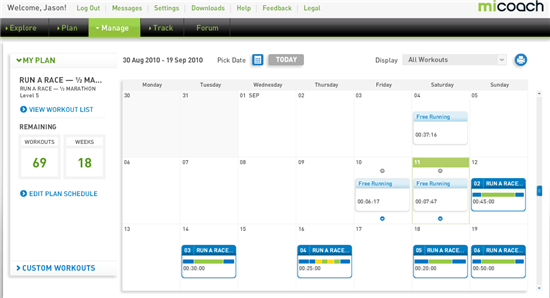
That’s pretty much complete for just about anyone who wants to track his/her workout. The Adidas miCoach app is work0ut-based and has the ability to sync your workout calendar (which is front and center) set in the miCoach website. If you don’t have any workouts scheduled, you can always opt for a Free Workout on the app. One benefit from scheduled workouts on the miCoach, you can actually get coaching feedback on your performance and on-the-run voice coaching. You get encouraging messages at the end of a workout on the Nike+ GPS app, but that’s about it.
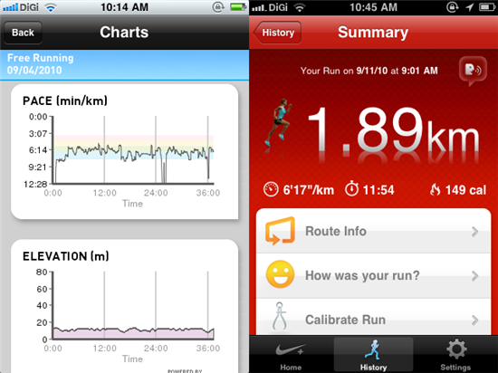
Looking more in depth into tracking, the miCoach app will track workout history and overall achievements. The workout history is another interesting point, you get to view details such as pace, elevation and splits timing over time in the form of charts. These are missing from the Nike+ GPS app, which only records the highest/slowest pace in a particular workout. With the miCoach app, I get plenty of information (in addition to the summarized run details) at my fingertips without having to go to the website all the time.
One thing that the Nike app does different (although it sounds trivial) is the inclusion of a “Power Song”. Basically, hitting the “Power Song” button during your workout will trigger a pre-selected song to play to give you an extra boost. Trivialness aside, in terms of usability, the miCoach app locks the screen during your workout, and you’ll need to slide a bar before getting access to the pause and finish buttons. This is a cool thing, as it prevents the accidental triggering of either of the two buttons. The Nike+ GPS has a huge pause button on screen with no screen lock.
Presentation wise, the miCoach app makes it easier for runners to view the tracking information on the run (with large, black fonts and light coloured background), and while the Nike+ GPS app is all decked out in red (and black ,if I’m not mistaken), it doesn’t make it easy for runners to see their run details. Both apps come with voice notification that can be preset under their respective app settings among other things (weight, height, measurement system, etc).
The miCoach app has an additional security layer when it comes to accessing the app, you’ll need to key in a 4-digit pin. This prevents other people from accessing the app.
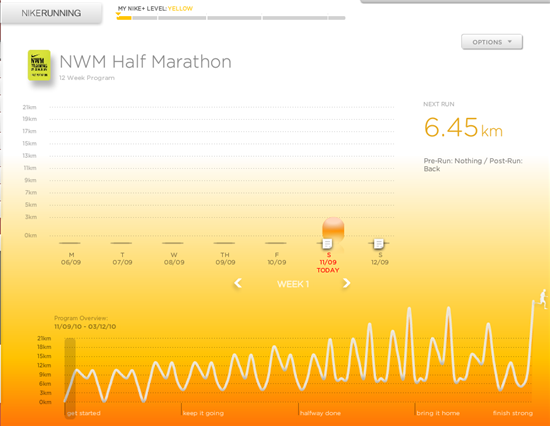
On the web front, the Nike+ website, is more goal-based. For example, there’s a preset goal for running in a half marathon. Selecting that will produce a calendar with the workouts highlighted on certain days. This schedule however does not get downloaded to the iPhone, unlike the miCoach site. The Nike site has an over emphasis on Flash and while it certainly looks flashy (no pun intended), it’s more like to cover up some inadequacies. I’ve set up my Half Marathon plan on the Adidas site and my workout calendar is promptly updated. All I have to do now is to sync up my miCoach app with the site and I’m ready to go.
One advantage that the Nike+ website has is that it can automatically share your workout activities on Twitter and Facebook, whereas for Adidas, it’s limited to Facebook. But it is not a problem to take the link to a publicly shared workout and put it up on Twitter manually.
Having gone through both apps and their websites, I must say that the Adidas miCoach app does what the Nike+ GPS app does and better, and it does so for free. You’ll need to cough out USD 1.99 for the Nike app and I don’t see why one would spend money on it other than one being an adamant Nike supporter. To me a running app without an emphasis on workout plans doesn’t bring any value for the amount of money it is asking for since its closest competitor does it for free and with a professional slant.
This turned out to be a pretty long post, but hey, give the Adidas miCoach app a try and it’s free: https://itunes.apple.com/us/app/micoach/id383809424?mt=8
For the sake of fairness, check out the Nike+ GPS app as well: https://itunes.apple.com/us/app/nike-gps/id387771637?mt=8


Nine Over Ten 9/10 » Nike+ GPS vs Adidas miCoach Review: Which is the Best Running App on the iPhone?…
The Nike+ GPS and Adidas miCoach apps for the iPhone are remarkably similar but since there can only be one (if you side certain brands, or are on a budget), check out my review on these two running apps….
This is a nice comparrison but this is wrong; The Nike+ GPS has a huge pause button on screen with no screen lock.
Theres a lock in the upper right corner
I have also used both apps and I think Nike+GPS gives a more accurate figure in terms of burnt calories and distance run. What do people think about this?