Hmm. I should have pointed out that in the last video game box art post, that Western box art tend to depict the protagonist as heroic whereas Japanese box art borders on the nonsensical.
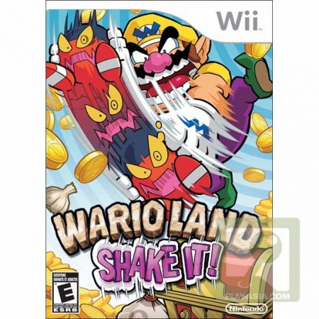
Case in point: Wario Land Shake a.k.a Wario Land Shake It in its American release:
The North American cover has Wario shaking up a bad guy, in a rather macho/tough guy pose. And of course, the reward for shaking a bad guy up is coins (at least in the game..don’t do this in real life).
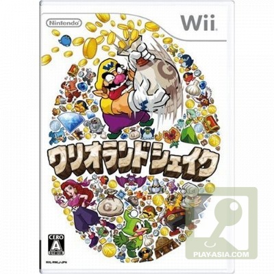
On the other hand, the Japanese cover depicts Wario as a greedy bastard (even his tongue is sticking out) shaking up a money bag for more moolah to come out, which is closer to the true nature of Wario as a character (he is a not really nice fella). And look at all the loot he has amassed.


I noticed that Japanese like to utilise a lot of white space in their cover.
In this case, somehow, I prefer the American version. The Japanese version while reflecting Wario’s style, seems to be a bit boring.
[…] More here: Nine Over Ten 9/10 » Video Game Box Art Comparison: Wario Shakes It […]
Hehe.. I prefer the Jap cover. Wario is already as fat as he is, don’t need him plastered all over the box art
I think we can really say that Japanese covers are always better than their American counterparts. Seriously. It’s really sweet looking at Bowser scream and Luigi, just being Luigi.
Same here. Americans tend to over do stuff.