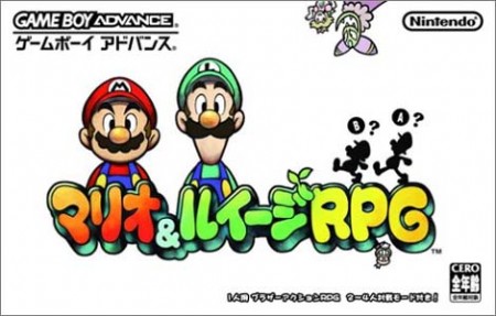
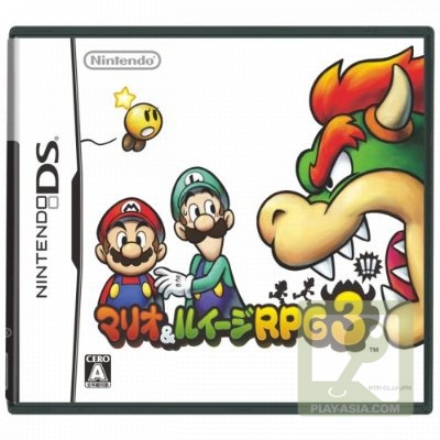
If you are wondering why does the cover for the Japanese version of Mario & Luigi RPG 3!! looks so understated, you’ll have to look back at the covers of the first two games in this trilogy. All three covers share the same understated look, starting with Mario & Luigi RPG for the Gameboy Advance:
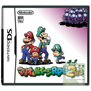
This is followed by Mario & Luigi RPG 2, which was released for the Nintendo DS. This conveyed more of the game’s plot compared to the that of the cover for the first game.
And then the latest in this series, Mario & Luigi RPG 3!!, also for the Nintendo DS:
The North American version of the Mario & Luigi RPG games on the other hand, tend to sport very busy covers and even longer titles! Mario & Luigi: Superstar Saga (a.k.a Mario & Luigi RPG) for the GBA had the following cover:
Whereas Mario & Luigi: Partners in Time (a.k.a Mario & Luigi RPG 2) for the Nintendo DS had the following cover, which was very “busy” indeed:
As of now, there’s no word on the boxart and name for the North American release of Mario & Luigi RPG 3. Smart money is that both will be in the mold of Partners in Time and Superstar Saga. How about Mario & Luigi: Bowser’s Gastrointestinal Tract?


[…] More comparisons here […]
The name for the third one is Mario & Luigi: Bowser’s Inside Story
Ahaha, the japanese covers look awesome! Kinda scary mushrooms though, considering the targets are kids…